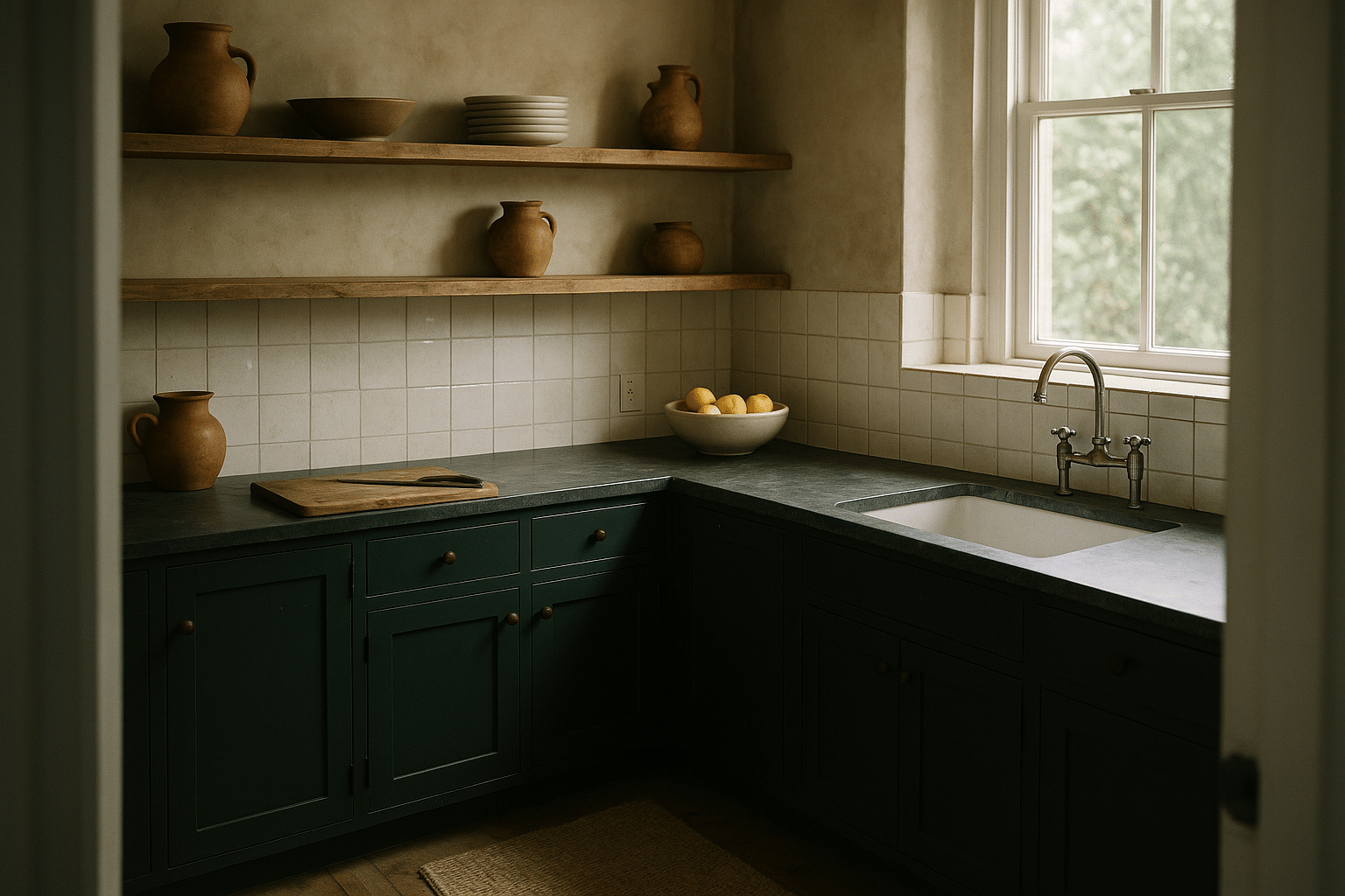
For years, the all-white kitchen has been a go-to in home design—clean, bright, and timeless. A shift is underway, as many homeowners seek more personality, warmth, and character in the heart of the home. We’ll explore the beautiful and sometimes unexpected colors driving this change.
Outline and Why Kitchen Color Is Changing
Outline of the article:
– Why kitchens are moving beyond white
– Warm neutrals and earth tones that feel cozy, not flat
– Moody blues and greens that add depth without heaviness
– Layered wood tones and natural materials that shape color decisions
– Conclusion and a simple plan for choosing shades with confidence
The all-white kitchen earned its reputation for clarity and resale friendliness, but the cultural mood has shifted toward spaces that feel grounded and personal. Daily life now spends more time in the kitchen: quick breakfasts, work-from-home lunches, and long dinners with friends. Color helps the room keep up, bringing warmth, contrast, and a sense of lived-in ease. Designers point to three drivers. First, comfort: mid-tone hues reduce glare and make surfaces look softer under both daylight and evening illumination. Second, biophilic cues: greens, browns, and clay-inspired neutrals echo natural materials, which research links to lower stress and perceived coziness. Third, individuality: homeowners want kitchens that reflect taste and routines, not a template seen in every listing photo.
Color also solves practical problems that white can amplify. Smudges and crumbs are less noticeable on warm taupe cabinets than on crisp white doors. Slightly darker islands disguise scuffs from stools and bags. Wood textures can handle nicks gracefully because marks read as patina rather than damage. Lighting plays a huge role, too. North-facing rooms benefit from warmer undertones to counter cool daylight; south-facing rooms can welcome cooler notes for balance. Rather than choosing a single hue for every surface, many contemporary kitchens use tonal layering: gentle contrast between uppers and lowers, a distinct island color, or a backsplash with quiet movement.
Think of the new direction as color with intent. The goal isn’t loud statements but harmonies that enrich daily rituals—morning coffee against a clay-toned wall, leafy herbs popping beside slate-blue drawers, oak shelves bringing grain and warmth to a soft greige backdrop. If you crave personality without chaos, the following sections show how to select hues that are forgiving, flattering, and enduring.
Warm Neutrals and Earth Tones: Cozy Without Going Beige-Only
Warm neutrals—greige, mushroom, putty, sand, and clay—are quietly reshaping kitchens. They keep the openness people appreciate from white while adding a touch of hearth-like comfort. The trick is undertone. A greige with a gentle green undertone calms red-toned floors; a taupe with a hint of violet neutralizes yellowed counters. When you’re comparing samples, view them beside fixed elements you’re keeping: flooring, countertops, and backsplash. Look for a shared undertone family so the palette reads cohesive rather than mismatched. Light reflectance value (LRV) can guide you. Walls in the 55–70 range feel bright but less stark; cabinets in the 35–55 range hold depth while staying cheerful.
Texture matters as much as color. A soft-matte cabinet finish diffuses light and hides minor wear better than high gloss. On counters, honed stone or subtly textured composite can sit beautifully against clay or mushroom cabinets because the finish echoes the visual softness. Hardware in muted metals—brushed, aged, or patinated—keeps the story warm without shining too brightly. If you have stainless appliances, warm neutrals help the steel feel intentional rather than clinical, especially when paired with wood accents like open shelves or a butcher-block cutting board.
Where warm neutrals shine:
– Small kitchens that need light but prefer less glare than pure white
– Open-plan spaces that share sightlines with living areas in earthy palettes
– Busy homes with pets or kids where durability and smudge-disguise matter
– Historic houses where warm tones honor original millwork and floors
Compared with cool grays that can feel flat under warm bulbs, earth-inspired neutrals remain welcoming from sunrise to late evening. They also photograph well under mixed lighting, which explains their popularity on listing sites and social feeds. For balance, introduce subtle contrast: slightly lighter uppers with deeper bases, or a soft-sand perimeter with a clay-toned island. If you’re unsure about commitment, start with a warm neutral on the island or pantry doors and live with it for a week. Watch it beside morning daylight and under your evening pendants; if it keeps looking inviting, expand the color to more cabinetry. The result is a kitchen that reads updated and calm, not trend-chasing.
Moody Blues and Greens: Depth, Calm, and Culinary Appeal
Blues and greens are the new statement-makers, prized for bringing depth without tipping into gloom. Deep blue, slate, inky teal, forest, and sage work because they link the kitchen to nature and food itself—think herbs, leafy vegetables, blueberries, and the sea. Color psychology research often associates blue and green with calm and focus, which is helpful in a room that blends task work and social time. A navy island under bright quartz can anchor a neutral kitchen like a well-chosen rug, while forest-green lowers with light linen-wall paint create a garden-adjacent vibe inside.
The key is managing contrast and light. In limited daylight, choose mid-depth hues with a touch of gray to diffuse saturation; in sunny rooms, richer pigments can look luxurious rather than heavy. Finishes influence the mood: satin or eggshell keeps moody colors tactile and forgiving, while super-matte feels ultra-soft but may show oil marks near handles. Pair these shades thoughtfully. Blue lowers thrive with warm stone veining, butcher block, or warm metal hardware; green cabinetry sings with cream, ecru, and natural fiber textures. If your floors are cool gray tile, pick a green with olive or moss undertones to avoid a minty clash. With warm oak floors, a slightly cooler blue prevents the room from skewing too orange.
Smart ways to sample moody hues:
– Paint a full door or large foam board, not just swatches
– Test across three light moments: morning, afternoon, and evening
– Check against appliances and backsplash to catch unexpected reflections
– Move samples vertically and horizontally to mimic cabinets and islands
Compared with stark black, which can read harsh in small spaces, deep blues and greens deliver sophistication with nuance. They also hide everyday scuffs more gracefully than white while providing enough contrast for hardware to stand out. If you’re nervous about going dark, try color-zoning: paint only the island or a tall pantry wall. Another option is to pair moody lowers with light, warm uppers to keep the eye moving upward. Over time, many homeowners find that these hues make cooking feel more intentional—like stepping into a quiet nook where flavors and conversation have space to bloom.
Layered Wood Tones and Natural Materials: Let Grain and Patina Lead
Not every color story starts with paint. Wood species, stain tone, and natural surfaces create a palette before a brush touches a door. Pale oak with subtle grain leans airy and Scandinavian; mid-tone walnut reads cozy and culinary; reclaimed pine introduces knotty texture and history. Each brings undertones—oak can run golden or gray, walnut can swing warm or cool depending on finish. When you combine painted cabinets with wood elements, let the wood set the temperature and saturation. If your oak is warm, choose wall and cabinet colors that nod to that warmth (mushroom, sand, putty). If your walnut leans cooler, slate blue or stony greige offers balance.
Patina tells a comforting story in kitchens that aim for coziness. Honed stone gradually softens at corners; handmade backsplash tiles show gentle variation; soapstone darkens with use and oil. These natural imperfections pair well with earthy palettes because they look intended rather than accidental. To keep depth without heaviness, mix finishes: matte cabinets, satin wood shelves, and a subtly reflective glaze on tile. Even a narrow galley kitchen gains dimension when light plays across multiple textures.
Quick checks before committing:
– Put wood, tile, countertop, and paint samples together on the same surface
– Observe under daylight and warm evening bulbs to spot shifts
– Note how knots, grain, and veining interact—busy plus busy can overwhelm
– Consider maintenance: some stones etch; some finishes show fingerprints
Sustainability is another reason natural materials are shaping the color conversation. Durable finishes and real wood can be refreshed rather than replaced, extending a kitchen’s lifespan. If you’re blending two wood tones, repeat each at least twice—shelves and stools in one tone, floor and cutting boards in another—so choices read as deliberate echoes. For paint, opt for hues that pick up micro-tones in your counters or tile; even a whisper of the same clay or olive pulls the scheme together. The outcome is a kitchen that feels collected, not constructed: grain, vein, and softly colored planes in a quiet dialogue that gets better with time.
Conclusion: Choosing Color With Confidence
Choosing a cozy kitchen palette is less about memorizing trends and more about reading your room. Start by auditing light. Note which walls capture morning sun, which corners sink into shade, and how artificial bulbs influence color warmth at night. Inventory fixed finishes—flooring, countertops, and backsplash—and identify their undertones. Decide on an anchor: it might be a walnut island, a clay-toned wall, or deep green lowers. From there, pick two supporting hues and one accent so the scheme has hierarchy and restraint.
A simple step-by-step:
– Build a board of large samples that includes paint, wood, tile, and metal
– Test at different times of day; remove any sample that looks off in one light
– Balance temperature: warm woods with cooler paint, or vice versa
– Use sheen strategically: matte hides wear; satin adds gentle life
– Color-zone to reduce risk: island first, then perimeter if you love it
For small spaces, keep upper areas lighter to avoid visual compression. Mid-depth lowers in greige, sage, or slate maintain coziness while letting light bounce from above. In open plans, consider how colors read from the living room; repeating a tone in textiles or shelving creates continuity. If resale is on your mind, warm neutrals remain widely appealing, while a colored island or pantry wall offers personality that’s easy to repaint later. Importantly, color is not just appearance—it’s function. Hues that disguise everyday marks, soften glare, and harmonize with materials make cooking and gathering more enjoyable.
As you fine-tune, remember that kitchens evolve. A new runner, a row of herb pots, or wood stools can tilt the palette warmer or cooler without a major overhaul. Choose colors that support how you live today and can flex tomorrow. When undertones align and textures converse, the room feels welcoming from the first cup of coffee to the last plate washed. That feeling—easy, warm, and lived-in—is why so many are stepping beyond white and never looking back.


